01. Overview
The financial institutions legacy member onboarding system was outdated, leading to inefficiencies and frequent errors. Employees struggled with navigation, excessive modals, and an inability to save progress, which resulted in repeated tasks and wasted time. The goal of this redesign was to streamline the process, improve usability, and enhance the overall efficiency of onboarding new members.
85%
Employees would report an improved ease of use if surveyed
100 hrs
Saved monthly for onboarding time per member
90%
Expected adoption rate in first 3 months
50%
Decrease in errors and network cases
*Estimated Metrics
Responsibilities
-
Leading discovery and requirement gathering
-
Mapping user journeys
-
Facilitating brainstorming sessions
-
Creating wireframes, low-fi & high-fi prototypes
-
Presenting to stakeholders and SMEs for feedback
User Testing
Role UI/UX Design lead
Team
UX Designer, UX Researcher, SME's, Financial Institution Employees, Business Analyst, Product Owners, Developers,
Tools

Sketch

Figjam

Figma
02. Problem
The existing legacy system for member onboarding at the financial institution posed several challenges for employees. Users struggled to navigate the system, often encountering errors or having to repeat tasks, leading to wasted time and resources.
Key pain points included:
-
Difficulty setting up new member accounts without navigating multiple tabs.
-
No ability to save progress and resume from where they left off.
-
An overload of modals disrupting the workflow.
-
Challenges in bypassing verification to add relationship details at any stage.
-
Issues ensuring all closed account information was accurately captured.


Example of too many modals, one after the other for 1 task.
Example of multiple tabs to navigate and set up account.
Example of no clear step by step process that causes errors and repeated tasks.
02. Problem
The existing legacy system for member onboarding at the financial institution posed several challenges for employees. Users struggled to navigate the system, often encountering errors or having to repeat tasks, leading to wasted time and resources.
Key pain points included:
-
Difficulty setting up new member accounts without navigating multiple tabs.
-
No ability to save progress and resume from where they left off.
-
An overload of modals disrupting the workflow.
-
Challenges in bypassing verification to add relationship details at any stage.
-
Issues ensuring all closed account information was accurately captured.


Example of too many modals, one after the other for 1 task.
Example of multiple tabs to navigate and set up account.
Example of no clear step by step process that causes errors and repeated tasks.
03. Design Process
🔍 Discovery The Product Vision/Goal
To understand the key challenges, I collaborated with subject matter experts (SMEs) who regularly interacted with employees. Their insights provided firsthand knowledge of the most pressing issues faced by employees during the onboarding process. Through brainstorming sessions, and user journey analysis, I identified critical pain points, inefficiencies, and areas where automation could enhance the experience.

Brainstorming sessions to identify the users journey and their pain points
👤 Persona Development Who are the users?
Primary Users: Financial Institution Employees
-
Needs: A seamless, efficient, and error-free workflow
-
Frustrations: Excessive modals, complex navigation, repeated errors, and wasted time
-
Goals: Easily set up new members without disruptions, quickly access member ID's, and ensure a smooth process from start to finish

📍User Journey
To thoroughly understand the user journey, I collaborated with the product team utilizing FigJam to map out the user flow, bringing together insights from documentation and understanding the existing legacy product. A detailed journey map was created to highlight friction points in the legacy system and opportunities for improvement. Through several brainstorming sessions, we aligned on the pain points and refined the journey, building a clear roadmap for the best possible solution. This journey map outlined each step employees took during member onboarding, pinpointing delays, redundant actions, and common errors. Additionally, it identified moments of frustration and inefficiencies, providing clear areas where the new design could enhance usability and streamline workflows.
👩🏻💻 Wireframing the Solution
After laying a strong groundwork for the user roadmap, the subsequent phase involved crafting wireframes to visualize the placement and structure of the new member design. Thoroughly examining existing designs was essential to uphold consistency across the platform, considering the existing constraints within the product. The iterative design process involved ongoing collaboration with the product team to incrementally develop the solutions, which were then shared with the broader team for feedback.
Key changes in the redesigned workflow included:
-
A simplified, step-by-step guided process.
-
Easy search functionality for member ID lookup.
-
Consolidated screens to reduce unnecessary navigation.
-
An intuitive verification process.
-
Clear task identification to highlight pending actions.
-
A reduction in modals to streamline workflow.
👩🏼🚒 Building Lo and Hi Fidelity prototypes
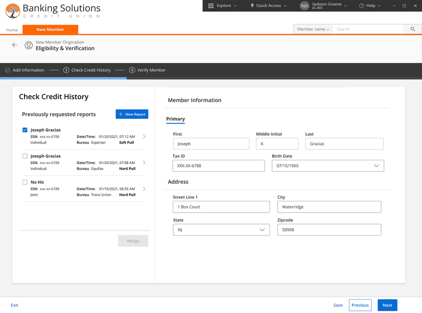
Translating wireframes into high-fidelity prototypes for usability testing. High-fidelity prototypes showcased an improved interface with:
-
A guided flow instead of disruptive modals.
-
A progress tracker for better visibility.
-
"Previous" and "Next" buttons instead of confusing close options.
Click video to prototype demo of mid fidelity iteration
04. Results & Takeaways
🧩 Usability Testing & Feedback
Moderated usability tests were conducted to validate design decisions.
Key findings include:
🧐
Users preferred "Next" buttons over "Close Credit Report," which they found misleading.
🤩
SMEs praised the simplified workflow and were excited about the implementation
🫶🏼
The integrated credit report retrieval process was more intuitive.
😃
Employees found the new flow significantly easier than the legacy version.
"...This prototype is already so much better then what we have today."
Lisa M,
Subject Matter Expert.
📝 Expected Impact
Although implementation is still pending, the redesign is expected to improve efficiency by streamlining account setup, reducing errors, and optimizing resources by minimizing troubleshooting and rework. Employees will benefit from a more seamless and intuitive workflow, enhancing satisfaction and productivity. Additionally, the new system provides a solid foundation for continuous user testing and iterative improvements, ensuring ongoing enhancements to meet evolving needs. Here's a HEART framework chart with estimated metrics based on expected improvements from the redesign.


